
CLIENT: France & Beyond Tours
This lovely client lived in France for many years and wanted to create a brand that reflected her style of tour - this is not the whirlwind type of tour that stops fleetingly at the major sites. Her tours include plenty of time for relaxation. Her previous logo was stereotypically french with the Eiffel tower and the colours red white and blue however did not represent the main point of difference in what she offers.
I wanted to create something that 'felt' french, restful AND intriguing so that the viewer wants to be on that tour!
The tours do stop in the French Alps so it was important that this was represented too.
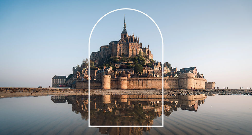
The idea of a view out of a typical French window is all about 'Stopping to take in the view'.
It is also said that window is a spiritual entrance through which your soul can travel which fits perfectly
Although the landscape could be French, it could also be somewhere ‘beyond’.
The vines breaking free of the line of the window frame create a feeling of stepping into the view, inviting the viewer to meander and explore, as does the path.


